Do you want a new look to your blog? Are you curious on how some professional blogs can look completely different than the options Blogger can give you? Have you considered using a downloaded blogger template? Dig down below to see how I change the look of my blog, the reason why I change it, and get yourself inspired to magically turn your boring blogspot theme into a wonder.
3 Reasons to Change the Look of Your Blog
1. Giving a more refreshing look
Giving a new refreshing look to your blog can give your writing gear (read:brain) a boost of passion. At least for me. Somehow changing the blog appearance feeds my brain with satisfaction. Don’t you think so?Like how one day you want to change the collection of outfits in your wardrobe, then you decided to buy a new scarf, or new coat. If you see that the number of posts in your monthly archive is declining, it might be the time for you to change the look of your blog.
2. Increase visitors experience
The problem with the usual theme provided by Blogger is that it is so…. usual. To make your blog outstanding and look more professional, then you will need an extra. Custom template is the answer.
You can find plenty of custom templates on the internet. Just browse ‘custom blogger template’ in the search engine. Some are free, but some are premium which means you need to buy it. Of course, each of the options have its advantages and disadvantages. Paid version might look so good, but you might not want to give up a little of your pocket money if your blog is not earning anything yet. Free version might limit you to some point. Anyhow, make sure that you don’t use pirated premium templates. Why? See my post about it in Sintong and Me.
Other than because it is so usual, the theme given in Blogger might not give your blog visitors the best experience they can have. For example, the choice of layout, featuring related posts to your article, social media sharing, etc.
3. Optimizing SEO
Another problem is free Blogger-provided themes are not designed to be SEO friendly. What is SEO? SEO stands for Search Engine Optimization. Having an SEO-friendly blog means your articles will be easily indexed by the search engine. So when people search for a topic related to your article, your article will appear in the search result. This will increase the number of visitors to your blog.You can change this by choosing SEO-friendly templates. Well, many claims that the templates they offer are SEO-friendly, but always check them first in seoptimizer.com or https://developers.google.com/speed/pagespeed/insights/
Do not change the template too often, though. Changing your template every two months is exaggerating. Changing template every two years, or make it as a start point for a new year blogging resolution, is just awesome.
Marking this end of year, I am specifically choosing Fiksioner for my blog. Fiksioner is a free blogspot template created by Igniel. Why did I choose it? My blogging coach, Mbak Marita, recommended this template because it is free but it is SEO friendly and responsive. The documentation and tutorial for this template is complete, so I hope it will be easy for a first timer like me. You can download the template directly from Igniel, and follow the instructions.
What Changes I Made to the Blog?
1. Header
 |
| Header Change |
My challenge in using Fiksioner is actually the height of the header it provides. So thin! Only 50 px if I am not mistaken. Compared to my previous theme, it was about one-third as wide. This means that I cannot use the previous header image, because it will look very small and becomes unreadable. Putting only the logo also does not satisfy my eyes, so I decided to make a new one. It took quite some time for me to decide what to do. When I finally found the solution, I felt very much content. This time the header only reads ‘A Logbook of Life Discoveries’ without my name on it. That’s fine because my name is already in the domain name, also there is a big about me widget in the sidebar.
2. Sidebar
 |
| Sidebar Change |
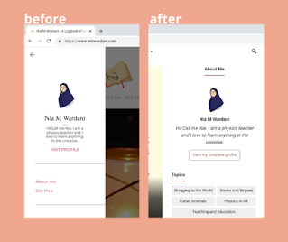
In the previous theme, my sidebar is hidden in the menu. So visitors need to click the three lines button on the header to view it, which most visitors wouldn’t unless they are very much curious about me.
This is a disadvantage for me, because I need to keep the visitors as long as possible on the page to increase my web rating. So I need a sidebar that is always visible on every page of my blog, so the readers can scroll down and see other posts.
The sidebar should also be located at the right side of the article because, according to my coach, this is the most comfortable layout for readers so that they are most likely to click on the other articles that appear on the sidebar.
3. Posts showcase in homepage
 |
| Post Showcase Change |
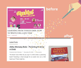
In the previous theme, the posts showcase only shows the first picture of the blog post and also the title. In the latest theme, now I choose to show also the text snippet of the posts so visitors can see the first paragraph of the post, before clicking it.
There are actually still many changes I need to make for the post pages, but I will keep it for times I need some coding for refreshing (LOL. Surprisingly I like html coding more than when I learned C coding. Maybe because I can directly see the visual result?).
Changing the look of your blog might invite more visitors to your blog. But yes, it is very delicate. You will need to see thoroughly each part of the pages. But the end result will pay you off. Do you want to try it for the new look of 2021?


of course i do, i wanna try some good template too
ReplyDeleteSekarang kalo baca postingan di blignya mbak nia emang lebih asik!
ReplyDeleteMantap, selamat dan sukses ya mbak, benar juga tampilan yang nyaman akan memancing gairah menulis.
ReplyDeleteHuhu aku jadi cantik blognya. Aku juga mau pake ini. Kudu berjuang dari awal lagi, nih.
ReplyDeleteAnd your blog it's really something right now. Congratulation sister
ReplyDeleteI love it, mbaak!
ReplyDeleteYeah, i wanna try a new look to my blog.
*boleh kan ikutan pakai bahasa inggris juga hehe*